Read a product label
Test the fine print against the packaging colour before setting the final type.

Choose a text colour and a background colour to preview the pair and read its contrast ratio.
Dark plum text on a pale pink background gives a contrast ratio of 10.01 to 1. This pair passes both the body text and large text checks in the tool.

Set the foreground to the colour you intend to use for the lettering.
Use the flat colour directly behind the letters. For a photo, test more than one part of the frame.
Compare the ratio with the body-text and large-text thresholds shown alongside the preview.
Check the actual pair your customers will read before committing it to a graphic.
Test the fine print against the packaging colour before setting the final type.
A price may be large while a unit or discount condition is small. Use the appropriate verdict for each.
Try a dark caption on a pale panel, then swap colours and inspect the preview.
Check whether brand lettering still reads against the chosen promotional background.
Enter the actual text and background colours. Aim for at least 4.5:1 for normal text or 3:1 for large text. Over a photo, test the lightest and darkest areas behind the lettering.
No. The ratio uses the lighter and darker luminance values. Swapping them changes the preview while keeping the same numeric ratio.
The checker uses 4.5:1 for normal body text and 3:1 for large text. A pair can pass one threshold and miss the other.
The inputs accept flat colours. Check representative light and dark areas separately, or give the text a solid backing.
The body-text check passes at 4.5:1. A 3.5:1 pair passes the large-text check here but falls short for body copy.
Keep purple in one colour field and adjust the other. Try a lighter background for dark purple text, or a darker background for a pale purple headline.
The two colours have the same relative luminance. Even if their hues look different, they provide no light–dark contrast for reading.
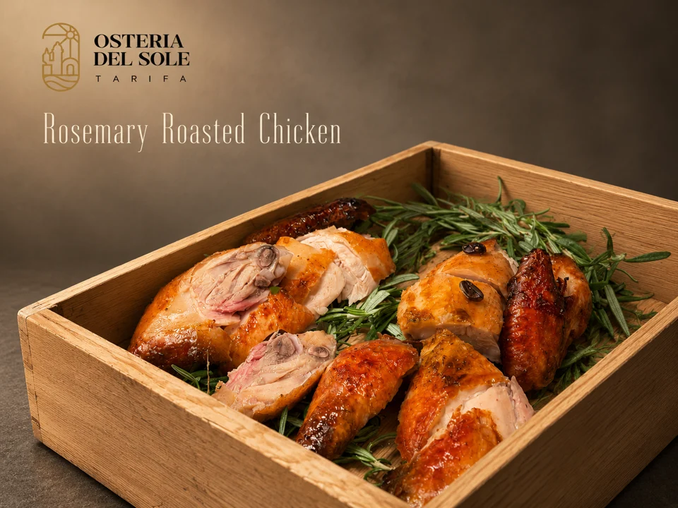
Menu Muse pairs the dish and restaurant names with food photography. Look at the area behind each line before settling on your poster colours.
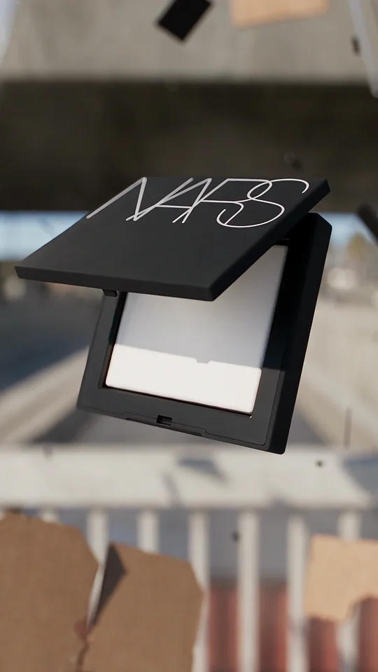
Compare the lettering on the compact with the isolated wordmark in the final shot.
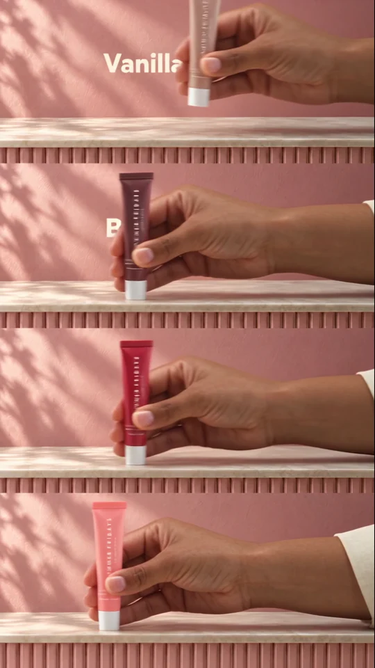
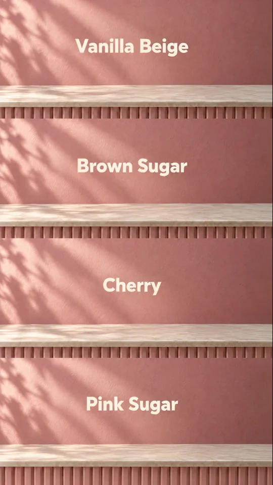
Four colourways fill four bands. Each shade gets a name so a shopper can tell the variants apart.
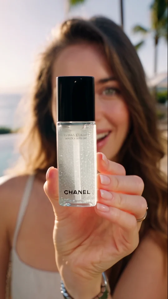
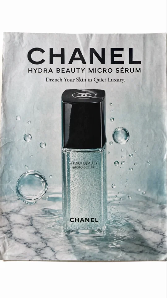
Compare the bottle in the presenter’s hand with its final poster. The larger silhouette still reads at thumbnail size.