Launch a collection
Use the product range as the headline with the store name above it.

Enter a headline, choose your colours and save the finished card as a 1200 × 630 PNG.
A pale citron headline on deep green keeps the invitation readable at a glance. The small issue line and two-line title are rendered by the tool itself.
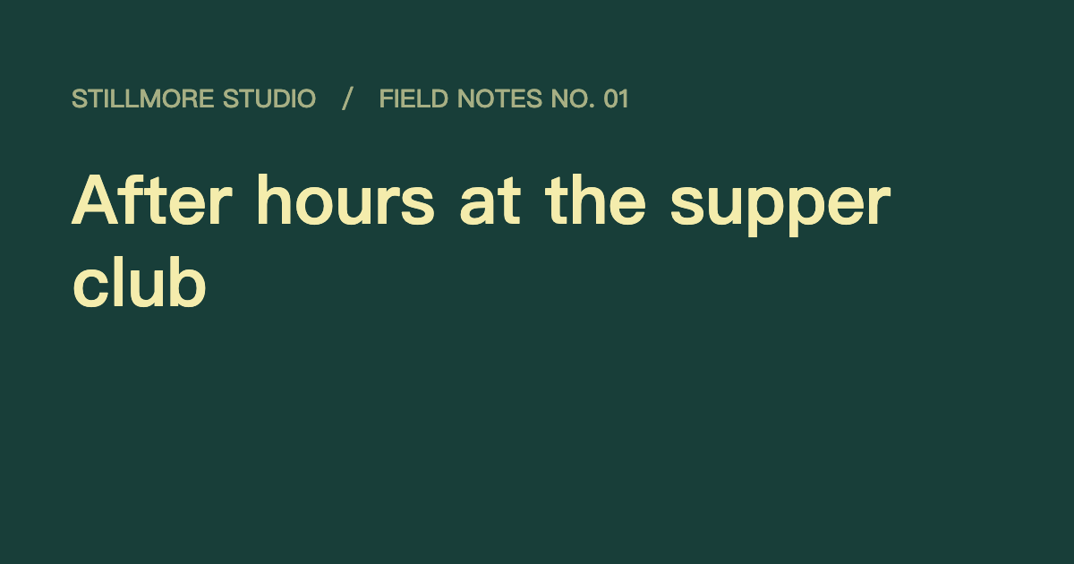
Enter a short page title and use the optional kicker for a collection name, date or domain.
Choose background and text colours that keep the headline readable at a small size.
Inspect the line breaks and download the 1200 × 630 PNG. Use the hosted image URL in your page metadata.
A share image appears beside other link information. Give its headline a job the page description does not already do.
Use the product range as the headline with the store name above it.
Put the event name on the main line and the date in the kicker.
Keep the colours and kicker consistent and change the headline for each instalment.
Give the link a deliberate cover before it begins circulating in newsletters and messages.
Upload the PNG somewhere publicly accessible, then set that image URL in the page’s Open Graph metadata. Social platforms can cache an older preview until they fetch the page again.
The title wraps at spaces and draws up to four lines. Shorten long headlines and break up unusually long words.
The layout uses a solid background and text. A photographic composition needs a photo editor.
Upload the PNG to your site and point the page’s Open Graph image field to its public URL.
It renders a 1200 × 630 PNG. The title and optional kicker are drawn onto the same canvas.
No. Leave it blank for a headline-only card. Use it for a short series name or issue label when that context helps.
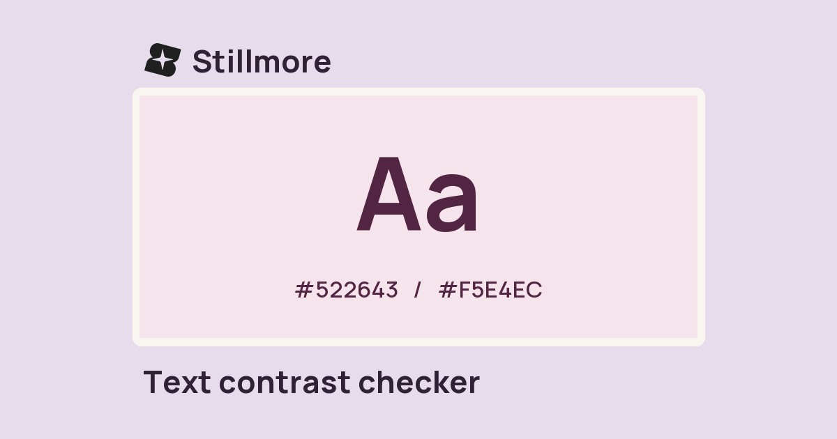
Preview the card at a small size and check the foreground and background colours in the text contrast checker. Shortening the headline also leaves more room around it.
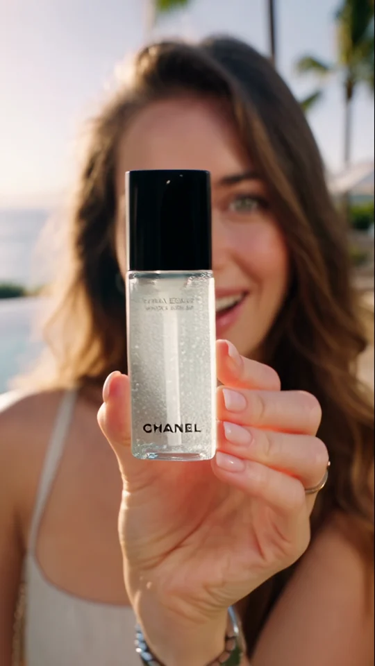
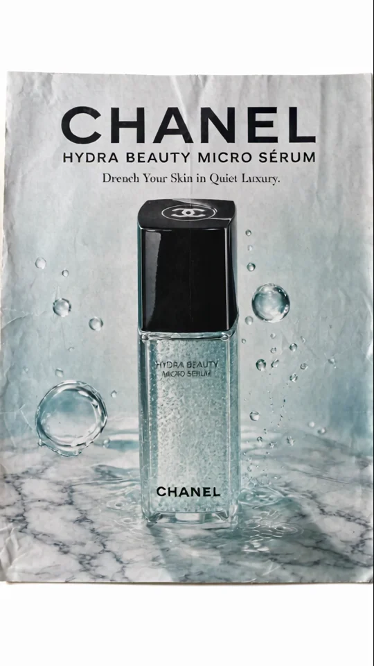
Zoom & Reveal finishes on a poster-like composition. Use that example to plan how much of your link card a headline can occupy without competing with the main subject.
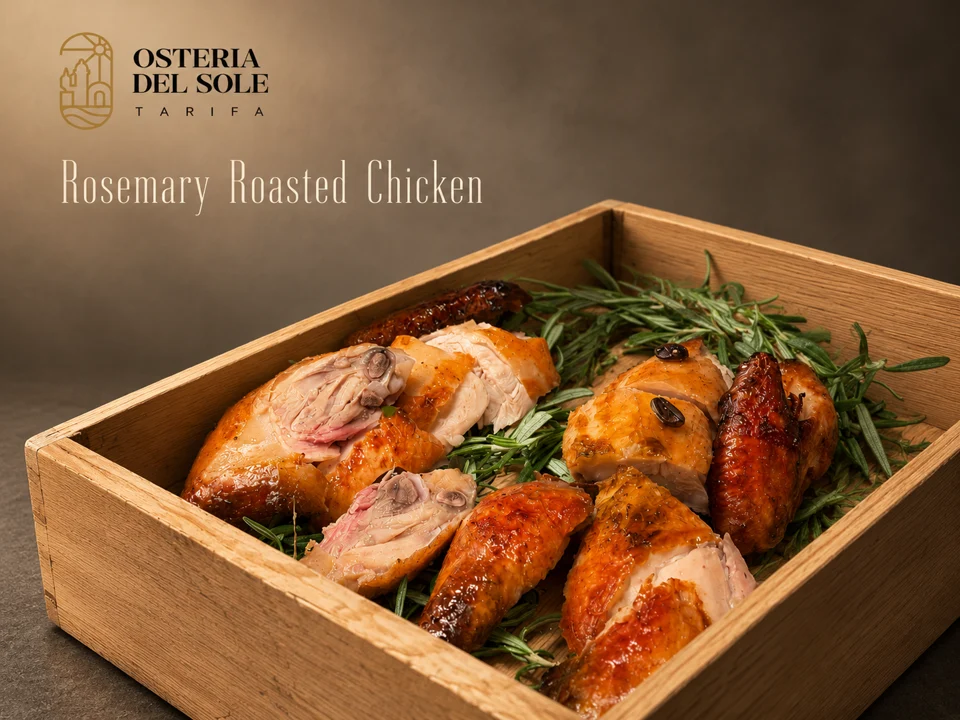
Look where the dish name sits against the food photograph. The background behind the type affects how easily you can read it.


The teal bodywork carries through to the backdrop. Look at how the wide shot picks up a colour from the close-up.
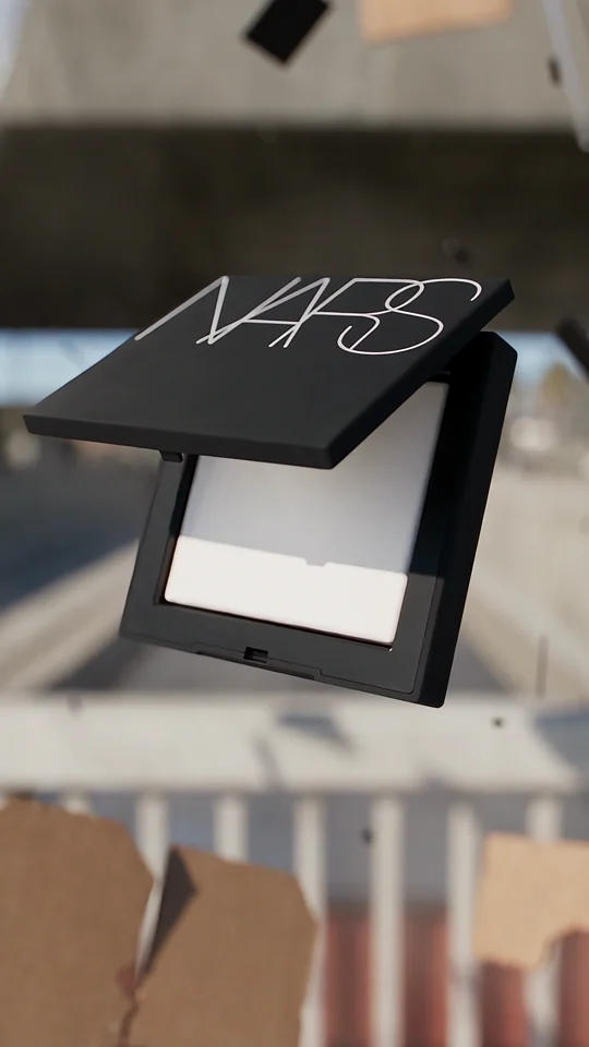

Compare the lettering on the compact with the isolated wordmark in the final shot.