Launch a store site
Use the store’s emblem and check the 16 px version beside other tabs.

Start with a square logo, ideally 512 × 512 px or larger. Download six PNG sizes and one multi-size ICO.
This PNG comes from the sample logo above. Compare it with the 16 px tab preview: the smaller version is the one a shopper will see among open tabs.

Use a simple symbol with enough space around its edges. A wide wordmark gets squeezed into a square.
The tool renders six PNG files and combines the three smallest sizes into one ICO.
Download the ICO for your favicon slot and the PNG sizes requested by your site builder or manifest.
Test the smallest icon first. Fine lines disappear much sooner in a browser tab than on a landing page.
Use the store’s emblem and check the 16 px version beside other tabs.
Send the multi-size ICO and name larger PNGs by their pixel dimensions so the developer can pick the right asset.
Use the 180, 192 or 512 px PNG when a site configuration asks for that square size.
Generate both variants and view their smallest files side by side at actual size before approving one.
At small sizes, a single recognisable shape holds up better than a wordmark with fine lettering. Try a square symbol and inspect the smallest PNG at actual size.
The PNG sizes are 16, 32, 48, 180, 192 and 512 pixels square. The ICO contains the 16, 32 and 48 px versions.
The image is scaled into a square at each size. Prepare a square canvas with padding around the logo before generating the set.
Upload the chosen file to your site builder or reference its hosted path in the site’s icon configuration.
The favicon.ico file contains 16, 32 and 48 pixel versions. The larger icon sizes are available as separate PNG downloads.
Yes. Choose your logo and inspect the 16 px browser-tab preview. If letters disappear, try a simpler mark with more space around it.
Yes. Use a square PNG with a transparent background. The icon canvas keeps transparent areas when it creates the smaller PNG versions.
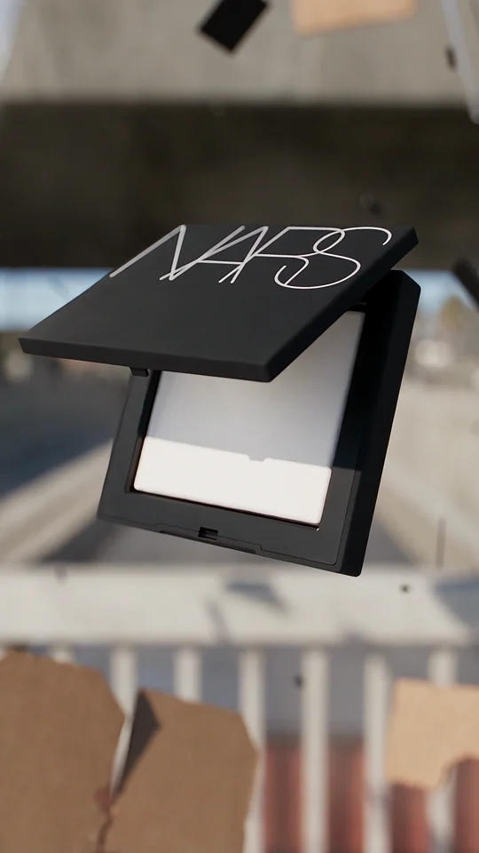
The NARS compact and closing frame both carry the full wordmark. When you prepare your own site icon, compare the lettering with a simpler mark at 16 pixels.
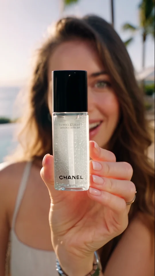
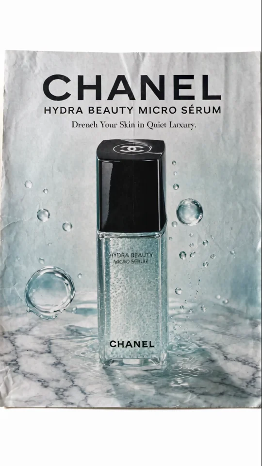
Compare the bottle in the presenter’s hand with its final poster. The larger silhouette still reads at thumbnail size.
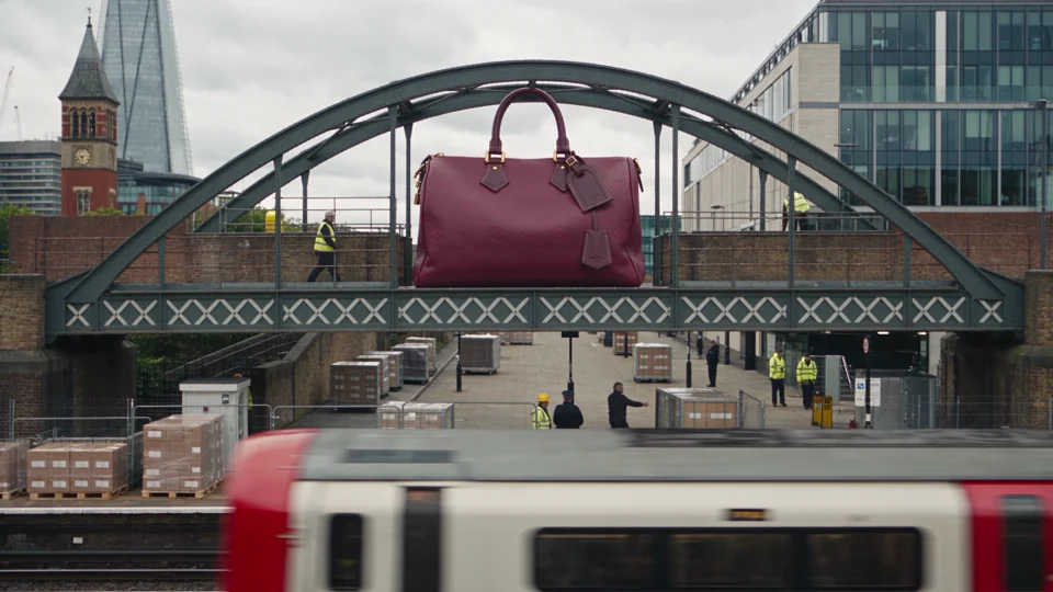
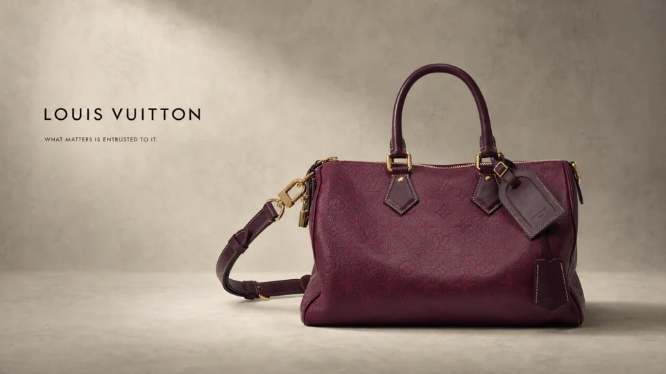
Compare the handbag spanning a bridge with the same bag in the studio. Its outline makes it recognisable at both scales.

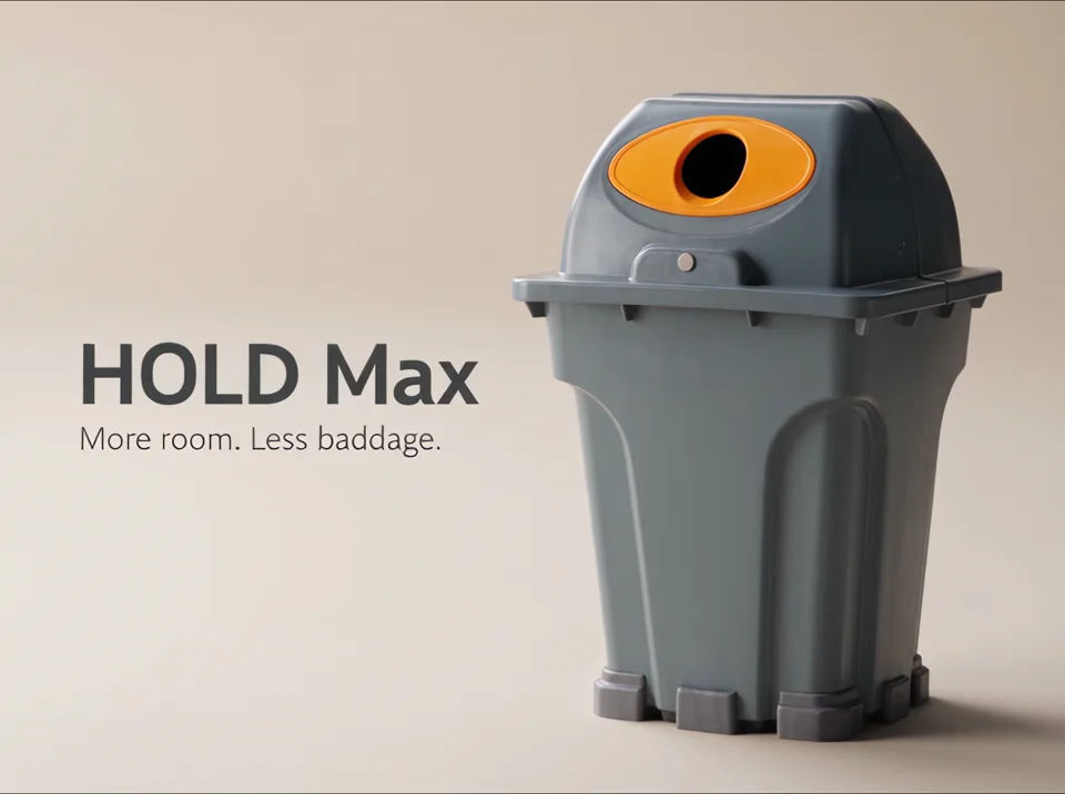
The lid and bin appear separately, then together on a plain background. Each shot communicates a feature visually.